
Genre Book Cover Design Guide for Indie Authors
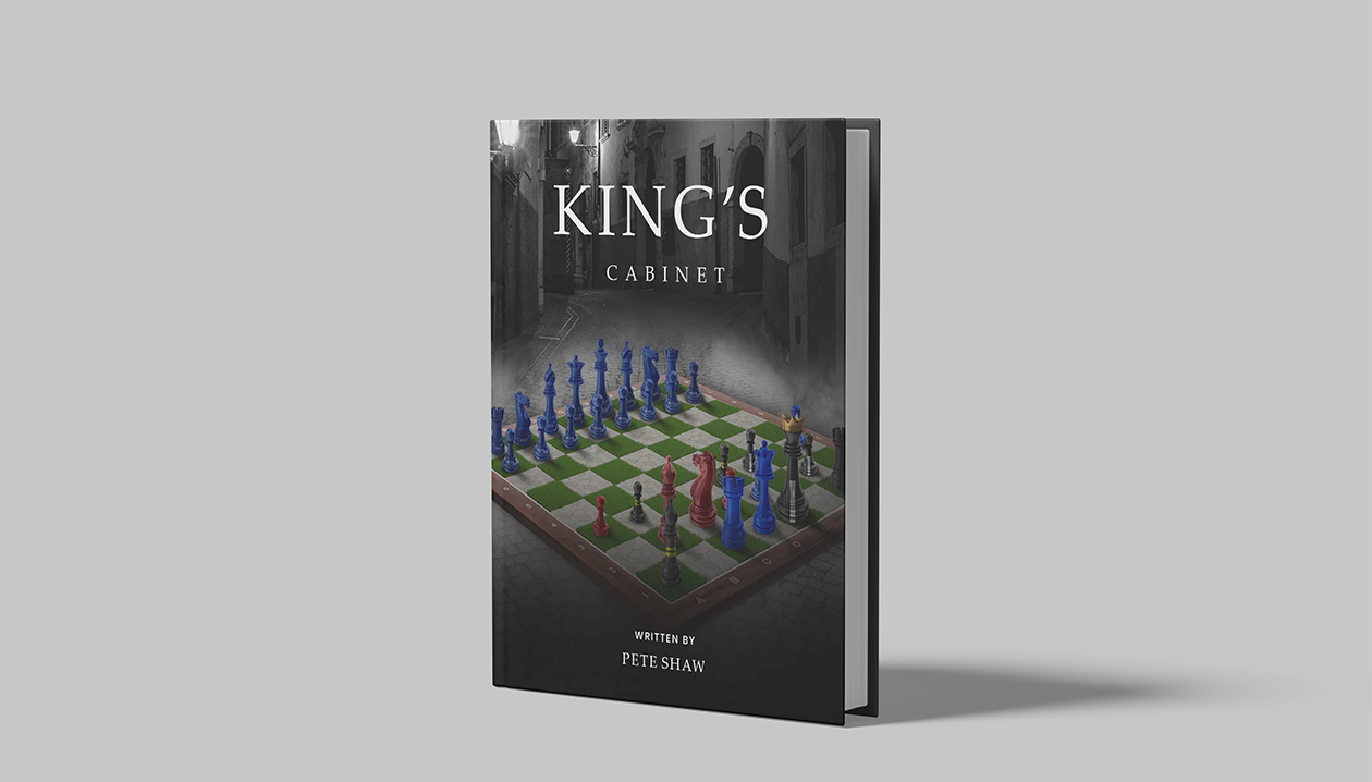
Book cover design for indie authors is genre-specific. A cover that would sell well in the contemporary romance category would confuse readers in the epic fantasy category. This guide explains how covers signal genre across the five most common indie author markets — romance, fantasy, thriller, memoir, and non-fiction — with specific design principles and the common mistakes that cause covers to miss their audience.
Why Genre Signals Matter on a Cover
Readers in every genre have internalized a set of visual codes — colors, typography conventions, imagery styles, and compositional norms — that they use to categorize books almost unconsciously. A reader who browses a bookshelf or an Amazon category page makes a genre judgment from a cover before they read the title, before they read the blurb, and before they look up the author.
When a cover signals the wrong genre — or no genre at all — the reader moves on. The book does not get a chance to sell itself through its writing, its premise, or its reviews, because the cover has already told the reader 'this is not for you.'
The thumbnail test: Most book buying decisions are made at thumbnail size — a 150–200 pixel wide image on a phone screen. A genre-accurate cover communicates its category at thumbnail size. A genre-confused cover looks like a generic image at thumbnail size. Every book cover should be evaluated at 150 pixels wide as part of the design review.
Romance Book Cover Design Guide
Romance is the largest-selling fiction category in indie publishing and also the most visually codified. Romance readers are highly attuned to cover signals and self-sort into subgenres quickly. Explore our Romance Book Cover Design Services.
- Color temperature signals heat level: Warm palettes (peach, blush, gold) signal clean/sweet romance and contemporary romance. Cool palettes (midnight blue, deep burgundy) signal dark romance and paranormal romance. Extreme contrast (black + single accent) signals villain romance and dark erotica-adjacent content. Warm amber and cream with ornamental details signal historical romance.
- Typography weight signals tone: Script fonts signal warmth, softness, and emotional focus. Heavy sans-serif fonts signal intensity, darkness, and possessiveness. The relationship between title typography and author name typography (size, weight, proximity) communicates the genre's emphasis on character vs. plot.
- Figural elements communicate heat level: Abstract or illustrated figures (no explicit imagery) signal moderate or lower heat. Close-proximity photographic figures with visible skin signal higher heat. Silhouette compositions with implied intimacy are a versatile middle ground.
- Series consistency is non-negotiable: Romance readers follow series. A series system with consistent palette, typography, and compositional structure allows readers to identify all titles immediately.
Common romance cover mistakes: Mismatched heat level (cozy pastel treatment on a dark romance), stock photography that suggests the wrong trope, too many elements competing for attention at thumbnail size.
Fantasy Book Cover Design Guide
Fantasy cover design centers on world-building promise — the visual language that tells a reader this is a world worth spending 400+ pages exploring. Explore our Fantasy Book Cover Design Services.
- Atmospheric depth is the primary signal: Fantasy covers suggest a world beyond the frame through depth of field, environmental scale, and layered compositional elements. A mountain range in the distance, a forest disappearing into fog, a city lit by unnatural light — these elements promise scope and discovery.
- Symbol and motif hierarchy: The central visual element — a crown, a sword, a rune, a map — tells the reader what the stakes are. Secondary elements add world-building texture without cluttering the composition. Typography should reinforce the world's tone: heavy serif for epic scope, geometric for secondary-world science fantasy, hand-drawn for cozy fantasy.
- Subgenre has its own visual dialect: Epic fantasy uses sweeping environmental scale. Dark fantasy uses shadows, cold lighting, and threat signals. Urban fantasy integrates contemporary settings with magical anomalies. Cozy fantasy uses warm, soft palettes with illustrated character work.
- Series architecture is a competitive advantage: Fantasy readers follow series obsessively. A cover system that is immediately recognizable as a series generates automatic back-catalog sales from new readers who discover the series mid-sequence.
Common fantasy cover mistakes: Over-illustrating (too many elements creating visual noise at thumbnail), using a generic atmospheric image with no genre-specific signal, typography that reads as modern or corporate rather than genre-appropriate.
Thriller Book Cover Design Guide
Thriller cover design is the most typography-dependent of all major genres. The title treatment often carries as much visual weight as any imagery — which is why thriller covers are more often successfully executed as near-typographic designs than covers in other genres. Explore our Thriller Book Cover Design Services.
- High contrast creates genre expectation: Dark backgrounds, high-contrast typography, and minimal color palette signal thriller immediately. Cold blues, deep greys, black, and desaturated greens are the dominant palette. Red is used selectively as a threat signal — not as a design default.
- Negative space creates unease: Thriller readers expect to feel unsettled before they open the book. Negative space — empty corridors, partially visible figures, ambiguous shadows — creates the visual equivalent of the genre's narrative tension. What is not shown is often more effective than what is.
- Typography is the primary genre signal: Heavy sans-serif or slab-serif typography at a large scale creates the visual aggression characteristic of the thriller category. The title should visually dominate the cover — this is not a genre where an atmospheric image replaces typographic presence.
- Subgenre cues are specific: Psychological thrillers use interior imagery (doors, windows, close-up details), isolation motifs, and fragmented compositions. Crime thrillers use urban environments, procedural aesthetics, and documentary-style imagery. Action thrillers use kinetic compositions, motion elements, and directional energy.
Memoir Cover Design Guide
Memoir covers bridge personal narrative and non-fiction aesthetics. The author's identity is the subject — the cover must communicate who the author is and why their story matters, without the genre shorthand available in fiction categories.
- Author presence signals the personal narrative: A memoir cover typically foregrounds the author — through a photograph, an illustrated portrait, or a strong personal symbolic element. The cover says 'this is one person's story' through the specificity of its imagery.
- Title treatment communicates tone: A lyrical, hand-lettered title suggests a reflective, literary memoir. A clean, bold sans-serif title suggests a practical, resilience-narrative memoir.
- Design reflects period or setting: Memoirs set in specific historical periods or locations benefit from design elements that signal context — period typography, era-specific color treatment, or setting-specific imagery.
Self-Help and Non-Fiction Cover Design
Non-fiction and self-help covers communicate authority and promised outcome above all else. The reader's question is not 'what kind of story is this?' but 'can I trust this person to help me solve this problem?'
- Clarity over mood: Non-fiction covers prioritize clear, readable title treatment and immediate communication of the book's topic or promise. Atmospheric imagery is secondary to typographic legibility.
- Author name prominence: In non-fiction, the author's name carries more weight than in fiction — particularly for books where the author's expertise is the selling point. Author name size and prominence should reflect the author's recognition level.
- Visual promise of outcome: The best non-fiction covers visually represent the outcome the reader is buying — transformation, clarity, success, relief.
How to Test Your Cover for Genre Accuracy
- Thumbnail test: Resize your cover to 150 pixels wide. Can you tell the genre at that size? Is the title readable?
- Category shelf test: Place your cover next to the top 10 covers in your Amazon subcategory. Does it feel like it belongs?
- Reader test: Show your cover — without any context — to 3–5 readers who are in your target genre. Ask them what genre and subgenre they would expect.
- Heat level test (romance only): Show your cover to romance readers and ask them to estimate the heat level.
Common Genre Cover Mistakes
- Using a stock photo that has appeared on many other book covers
- Prioritizing personal preferences over genre conventions
- Using too many elements — creating visual noise at thumbnail size
- Ignoring thumbnail readability — title disappears at 150 pixels wide
- Mismatching typography and imagery tone
- Skipping the brief — starting design without confirming genre, subgenre, heat level, tone, and comparable covers
Frequently Asked Questions
How important is it to match my cover to comparable books in my genre?
Extremely important. Comparable cover research (looking at the top 20–30 covers in your Amazon subcategory) is the most reliable way to understand the current visual conventions of your genre. Visual conventions evolve — current comparables reflect what readers in your genre expect right now.
Can I use the same cover designer for multiple genres?
Yes, if the designer has proven experience in each genre. A designer who is excellent at dark romance covers may not understand the visual codes of epic fantasy. Always review portfolio work specific to your genre before hiring.
What genres are hardest to design covers for?
Literary fiction and speculative fiction that crosses genre boundaries are the most challenging. When a book does not fit cleanly into a visual category, the cover must either commit to one genre's visual codes or find a distinctive approach that signals the hybrid nature.
Should my cover look professional or distinctive?
Both. Professional means the cover signals your genre correctly and looks polished at every size. Distinctive means it stands out within the genre conventions rather than being indistinguishable from every other cover in the category.
How often should I update my book covers?
When your cover is performing poorly (low click-through rate in ads, low conversion from cover reveals), when genre visual conventions shift significantly in your category, or when a series needs a cohesive redesign. A cover redesign is a legitimate marketing investment.
Ready to build your author presence?
Explore our packages or get in touch for custom book covers, websites, and trailers.