
Book Cover Design for Indie Authors: What Sells
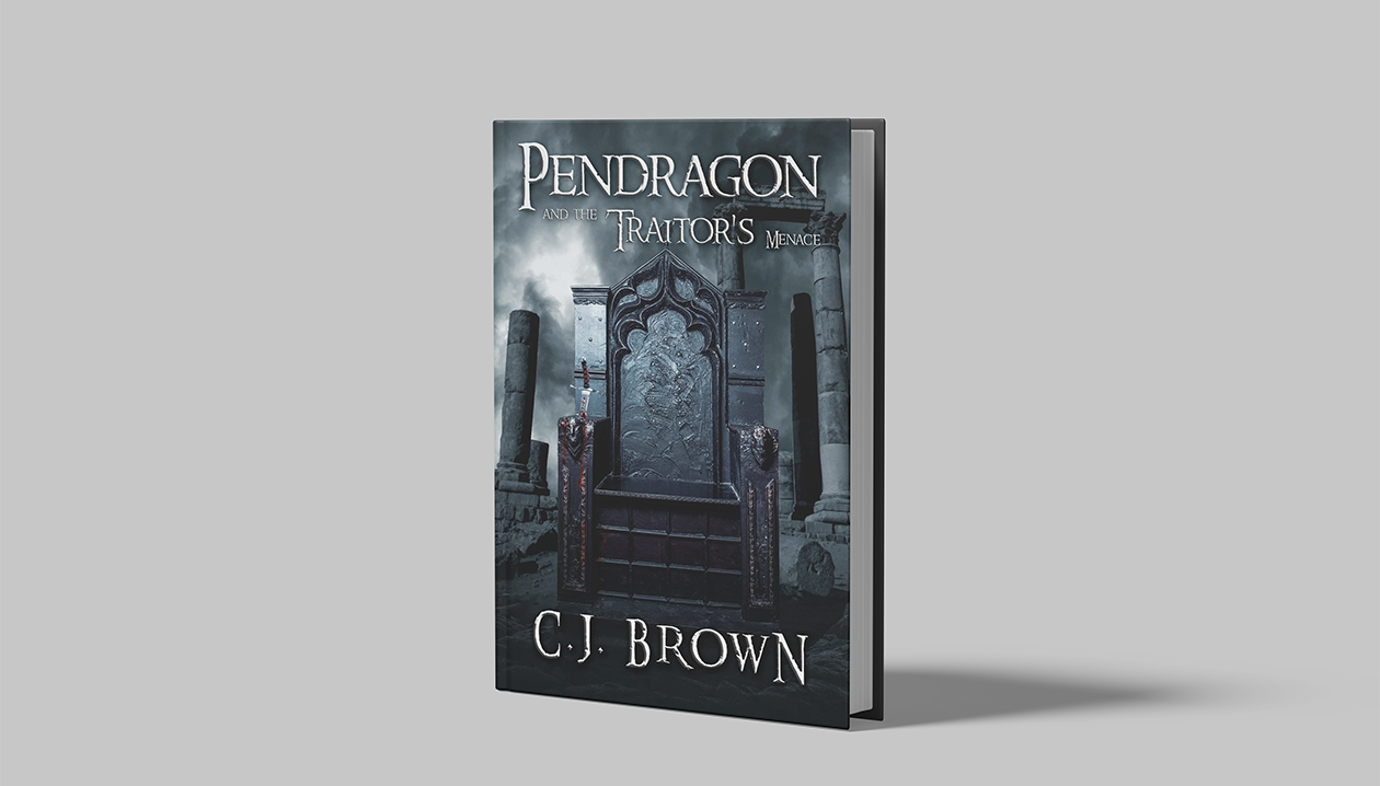
A professional book cover design for indie authors communicates genre at a glance, passes the thumbnail test, and competes visually with traditionally published titles. It is the single highest-impact investment a self-published author can make before launch.
You spent months writing your book. You revised it, edited it, and finally hit publish. If your cover does not stop a reader mid-scroll in the first two seconds, much of that work may never get noticed. For indie authors, the book cover is not decoration. It is your first and sometimes only marketing moment.
This guide covers everything self-published authors need to know about book cover design, including genre signals, thumbnail testing, the real cost of professional design, and the mistakes that can quietly hurt sales.
Why Your Book Cover Is Your Most Important Marketing Asset
Ask any reader how they discover new books and the answer almost always includes browsing. On Amazon, Goodreads, and the Kindle store, readers scroll rapidly through grids of small images. Your cover has roughly 1.5 seconds to communicate three things: what genre this is, who it is for, and whether it looks professional enough to buy.
A weak cover creates a credibility gap before a single reader opens the first page. Readers make instant unconscious judgments. If the cover looks self-made, many readers assume the writing is too.
What a Strong Cover Actually Does
| Function | What It Signals to Readers |
|---|---|
| Genre placement | “This is the kind of book I read” |
| Tone and mood | Dark thriller vs. cozy mystery; sweeping epic vs. grounded literary |
| Target audience | Adult vs. YA; general fiction vs. niche subgenre |
| Production quality | “This author invested in their work” |
| Story promise | A visual hint at what the emotional experience will be |
A cover does not need to literally illustrate your plot. It needs to make the right reader feel something.
Genre Signals: The Unspoken Visual Language of Book Covers
Every genre has a visual language. Readers absorb these conventions over thousands of hours of browsing without consciously recognizing them. As an indie author, you need to speak that language fluently or hire someone who does.
Genre Cover Conventions at a Glance
| Genre | Typical Visual Signals | Font Style | Color Palette |
|---|---|---|---|
| Romance | Couple embrace, soft lighting, skin, flowers | Script or serif, ornate | Warm pinks, golds, deep reds, purples |
| Thriller & Suspense | Silhouettes, urban fog, dark corridors, lone figure | Bold sans-serif, stark | Black, grey, blood red, muted tones |
| Fantasy | Landscapes, magical elements, cloaked figures, crests | Elaborate serif, textured | Deep blues, forest greens, gold accents |
| Horror | Darkness, decay, distorted faces, unsettling geometry | Scratched, uneven, dripping | Black, deep crimson, sickly yellows |
| Mystery | Shadows, magnifying glass, vintage texture, clues | Classic serif | Navy, brown, muted gold |
| Memoir & Self-Help | Author photo, clean space, bold typography | Clean sans-serif | White, neutrals, single accent color |
| YA | Characters with personality, dynamic poses, bright backgrounds | Bold, playful or edgy | High contrast, vibrant |
Breaking genre conventions is possible, but it should be deliberate and supported by a strong marketing strategy. For most indie authors, especially those launching their first or second book, matching genre expectations is the safer and higher-converting choice.
The Thumbnail Test: Does Your Cover Work at Small Sizes?
This is the single most overlooked step in indie book cover design, and it costs authors sales every day.
The majority of book discovery happens on screens, including Amazon product listings, Kindle store grids, Goodreads shelves, and social media posts. In most of these contexts, your cover appears at 80–160 pixels wide. That is roughly the size of a postage stamp.
How to Run a Basic Thumbnail Test
- Export your cover as a JPEG at full size
- Shrink it to 100x150 pixels in any image tool (even your phone’s photo editor)
- Place it next to 6–8 competing titles in your genre at the same size
- Step back from your screen and look at the grid
- Ask yourself:
- Does your cover read clearly at this size, or does the detail blur into noise?
- Does the title remain legible at thumbnail size?
- Does your cover look as polished as the traditional or well-designed indie titles beside it?
- Is the overall mood still communicated at a small scale?
Common Thumbnail Test Failures
| Issue | Why It Fails | Fix |
|---|---|---|
| Overly detailed illustration | Fine detail disappears at small sizes | Simplify the focal point |
| Small or thin title font | Title becomes unreadable | Use bold, high-contrast typography |
| Too many design elements | Visual noise at small sizes | Remove secondary elements |
| Low contrast between background and text | Text washes out | Increase contrast ratio |
| Generic stock photo | Invisible among similar covers | Use distinctive, genre-specific imagery |
If your cover fails the thumbnail test, it is failing on Amazon, Goodreads, and every social media post right now.
DIY vs. Professional Book Cover Design: An Honest Comparison
Many indie authors consider designing their own cover, especially for a first book. Here is an honest look at both paths.
DIY Cover Design
Tools like Canva, BookBrush, and Adobe Express have improved significantly and can produce serviceable covers. They still come with serious limitations.
Where DIY works:
- Non-fiction with a very clean, text-forward design
- Authors with genuine graphic design training
- Low-stakes testing of a concept before hiring a professional
Where DIY fails:
- Genre fiction where visual conventions are complex and specific
- Anything involving custom illustration or photomanipulation
- Covers intended to compete with traditional publishing imprints
- Authors without a design eye for typography hierarchy
Professional Cover Design
A professional designer who specializes in book covers brings three things a template tool cannot: knowledge of genre conventions, access to licensed premium stock and illustration assets, and the trained eye to make a cover feel effortless and polished rather than assembled.
DIY vs. Professional: Side-by-Side Comparison
| Factor | DIY | Professional |
|---|---|---|
| Cost | $0–$50 | $300–$1,500+ |
| Time investment | High (learning curve + design hours) | Low (brief the designer, review, approve) |
| Genre accuracy | Often misses nuance | Designer knows the genre market |
| Typography quality | Limited by template constraints | Custom, hierarchy-aware |
| Thumbnail performance | Frequently weak | Built to pass the thumbnail test |
| Commercial licensing | Often restricted | Full commercial license included |
| Long-term ROI | Low-to-medium | High for serious authors |
What Does Book Cover Design Actually Cost?
Cost is the primary reason indie authors consider DIY. Here is a realistic breakdown of what professional book cover design costs and what drives that number.
Book Cover Design Price Ranges
| Tier | Price Range | What You Get |
|---|---|---|
| Premade & Stock Covers | $50–$200 | Pre-designed cover personalized with your title and author name. Fast, affordable, but not unique |
| Freelance Designer (entry level) | $150–$400 | Custom work from a newer designer. Variable quality |
| Freelance Designer (mid-tier) | $400–$800 | Experienced designer with genre-specific portfolio |
| Specialist Book Cover Designer | $700–$1,500 | Deep genre knowledge, full revisions, commercial license |
| Full Package (cover + website + SEO) | Custom | Cohesive author brand across all platforms |
What Drives the Price Up
- Custom illustration vs. photo manipulation vs. typography-only
- Number of revision rounds
- Whether ebook-only or print + ebook (print requires spine and back cover)
- Series branding (covers 2–7 in a series are often discounted as a package)
- Rush turnaround
For most indie authors launching a genre fiction title seriously, the $400–$900 range represents the sweet spot between budget and quality. For a book you expect to sell for years, the design cost is typically recovered within the first few hundred sales.
How to Brief a Book Cover Designer (So You Actually Get What You Want)
Even a talented designer can produce the wrong cover if the brief is vague. The more clearly you communicate, the fewer revision rounds you burn.
What to Include in Your Brief
Essential information:
- Genre and subgenre (e.g. “dark romantic suspense” not just “romance”)
- Target readership (age, experience with the genre, comparable titles they read)
- 3–5 comparable covers you love and why. Do not just say “looks like this.” Explain what specifically works.
- 3–5 covers you want to avoid and why
- Mood or feeling. Focus on the emotion the cover should evoke rather than giving only a plot summary.
- Any mandatory elements (series branding, character descriptions if visible, setting)
- Formats needed (ebook only, paperback, hardcover, audiobook)
Helpful additions:
- Key themes or symbols in the book that could translate visually
- Your author brand aesthetic (if established)
- Notes on what your existing audience responds to
- Timeline and budget upfront
The One Question That Improves Every Brief: Before sending your brief, answer this: If a reader who loves [comparable author] sees your cover in a grid on Amazon, what should they feel in the first two seconds? That answer is your design brief in one sentence.
Book Cover Design and Author SEO: The Connection Most Authors Miss
Your cover is a visual asset, but it also has SEO implications. When readers search for books in your genre on Google or Amazon, your cover image is often the first visual element they encounter.
Alt Text and Image SEO
Every image on your author website, including your book cover, should have descriptive alt text. Use something specific such as “dark romantic suspense novel cover for [Book Title] by [Author Name]” instead of “cover.jpg.”
This helps your cover appear in Google Image Search, which drives meaningful traffic for authors in visual genres like romance, fantasy, and thriller.
Cover Design Consistency Across Your Author Platform
A strong cover design should inform your entire author presence:
- Author website: Cover imagery sets the visual tone of your site
- Social media: Cover color palette used in graphics, headers, and promotional posts
- Book trailer: Cover visuals anchor the trailer’s opening and closing frames
- Email newsletter header: Cover-consistent branding increases click rates
When your cover, website, and marketing materials share a visual language, readers trust your brand. That trust translates directly into higher conversion rates.
Series Cover Design: Getting It Right From Book One
If you are writing a series, which is common for genre fiction authors, cover design decisions made on book one will affect every book that follows. Getting this wrong can be expensive to fix later.
What Series Cover Branding Requires
| Element | Why It Matters |
|---|---|
| Consistent color palette | Readers recognize your series on a shelf or in a grid |
| Consistent typography | Same title font across the series signals a unified identity |
| Consistent compositional structure | Same layout logic (figure placement, text placement) per cover |
| Series logo or badge | Clear series name and number in the same position on every cover |
| Tonal consistency | The mood of covers should escalate or evolve, not shift randomly |
Practical Advice for Series Authors
Book one’s cover establishes your visual brand for the entire series. Before commissioning book one’s cover, think through:
- Will the cover concept scale across 3–7 books without visual repetition?
- Can the designer commit to covering the full series (or will you need a new designer mid-series)?
- Have you established a visual element (color, motif, character framing) that evolves with each book?
Readers buy into series partly because of visual recognition. When your books two and three are instantly recognizable as part of the same series as book one, your series sell-through improves.
Frequently Asked Questions
What makes a book cover professional?
A professional book cover passes the thumbnail test, accurately signals genre, uses properly licensed high-resolution imagery, applies typographic hierarchy correctly, and is delivered in print-ready resolution of at least 300 DPI. Professional covers should look at home beside traditionally published titles in the same genre.
How long does book cover design take?
A professional designer typically delivers a first concept within 5–10 business days of receiving a complete brief. Full turnaround, including revisions, averages 2–4 weeks. Rush timelines of 1–3 days are available from many designers at a premium. Planning your cover design 4–6 weeks before launch is the safer standard.
Can I change my book cover after publishing?
Yes. Updating your cover on Amazon KDP, IngramSpark, or other platforms is straightforward. Authors re-cover books regularly when a cover is underperforming, when entering a new market, or when investing in a rebrand. A new cover will not affect your reviews, sales history, or ASIN. Many authors report meaningful sales increases after a professional re-cover.
What file formats do I need for my book cover?
For ebooks, use a high-resolution JPG or PNG with a minimum size of 1600 x 2560 pixels at 72–96 DPI. For print, use a PDF at 300 DPI with full bleed, spine, and back cover included, built to your printer’s exact trim size and spine width. A professional designer should deliver all required formats as part of the project.
Do I own the copyright to my book cover design?
This depends on your contract with the designer. Always confirm you receive full commercial rights before signing. Most professional book cover designers transfer commercial rights upon final payment. Be cautious with premade cover services that retain rights or restrict exclusivity. Clarify this upfront.
Should my book cover show my protagonist’s face?
It depends on genre and convention. Romance covers frequently show faces and figures because this creates reader connection and matches genre expectations. Thriller and mystery covers often use silhouettes or obscured faces, allowing more room for reader imagination. Fantasy varies by subgenre. Follow what the top-selling covers in your specific genre consistently show. Your cover needs to meet reader expectations, not only the author’s preferences.
How do I know if my cover is genre-appropriate?
Browse the top 20 bestsellers in your genre’s Amazon subcategory and look at them as thumbnails in the search grid. If your cover would look at home in that grid, it is genre-appropriate. If it stands out for the wrong reasons, it may be missing an important convention. A designer who specializes in your genre will usually know these conventions.
What is the difference between a premade cover and a custom cover?
A premade cover is designed in advance and sold to the first buyer who wants it, then personalized with their title and author name. It is faster and cheaper, but it is not unique. A custom cover is designed specifically for your book from scratch. Custom covers allow full control over imagery, mood, character representation, and series branding. For a book you intend to sell seriously over multiple years, custom design is usually the stronger investment.
Ready to build your author presence?
Explore our packages or get in touch for custom book covers, websites, and trailers.